It can sometimes cause quite the debate, especially with regards to the originator, i.e. the taker of the shot being overridden with regards to opinions about how it should be treated and cropped and used.
I'm not sure if Van Gogh ever had anybody wandering along from the tavern in town and saying over his shoulder "Why is that bit all blue and squiggly? Wipe that bit away and change its shape, and also it should be purple!" but I am pretty sure that if he had, then it would have caused an interesting and somewhat colourful discourse, at the end of which, I would like to believe, it would have remained blue and squiggly with perhaps a little extra emphasis on the squiggle just to be certain.
Part of the challenge when these conversations happen is that due to the very subjective nature of the perception of art, everyone is right and valid in their thoughts and opinions on it. We all have our own way of interpreting that which is presented to us, and we all have our own very distinct thoughts and emotions which can be triggered as a result. Show me some Monet's and I'll willingly show you the money, but show me some Pollock's and my appreciation of them can be summarized with one word that rhymes with his surname.
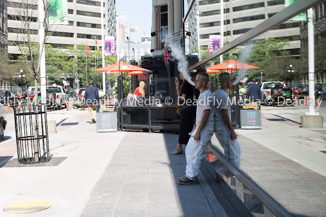
So here my dear reader is an interactive challenge for you. This first picture was shot while out on a wander around Downtown Toronto, and the composition and the people within it caught my eye right from the get go, when I first came upon the scene. I was fascinated by what I saw and captured it accordingly with my 50mm kit lens, so I could not adjust the composition by zooming in or out at all and took in the whole scene.
It's interesting in itself as is, and tells us a unique story of that moment, at that time for these people. The waitress busy serving lunch orders, the guy walking off into the distance, the smoker deep in thought and the vaper vaping his vape thing lost in vapey thoughts.
But.....what if I change it to black and white and change the main focus to here....?
What if we do it again...?
Now we are really focused in on the ponderous smokers and notice that we also have this fascinating bookend effect achieved by the blonde waitress looking in to the image on the left edge juxtaposed against the reflection of the dark haired man walking out of the shot on the far right.
Does this make for a more compelling image than the ones above? Is this one telling us more of a story by the subtle placement of details?
How about one final version....
Now we are almost dismissing of the real world beyond the smoke and drawn into the mirror universe. No longer aware of the lunchtime activity, but noticing half price wine is available nearby. We find ourselves wondering what is capturing the attention of Vapey McVapeface. What is he studying? Whats happening in the mirror?
Each version has its own story to tell. Each alteration redirects the attention of the viewer and brings different nuances to focus in the mind's eye for us to ponder. Each shot is arty and artful in its own right, but which one is the right one to use? My favourite is the third one, the bookends of people seems to tell me more of a story. I am as drawn to them as I am to the smokers in the centre. Does that make my choice right? As the photographer I am going to hedge my bets and say 'Bloody right it does!'; but what do you think? Which one draws your attention better and why?
One last thing...I'm calling it 'Smoke and Mirrors' but that could set off the whole debate all over again........


